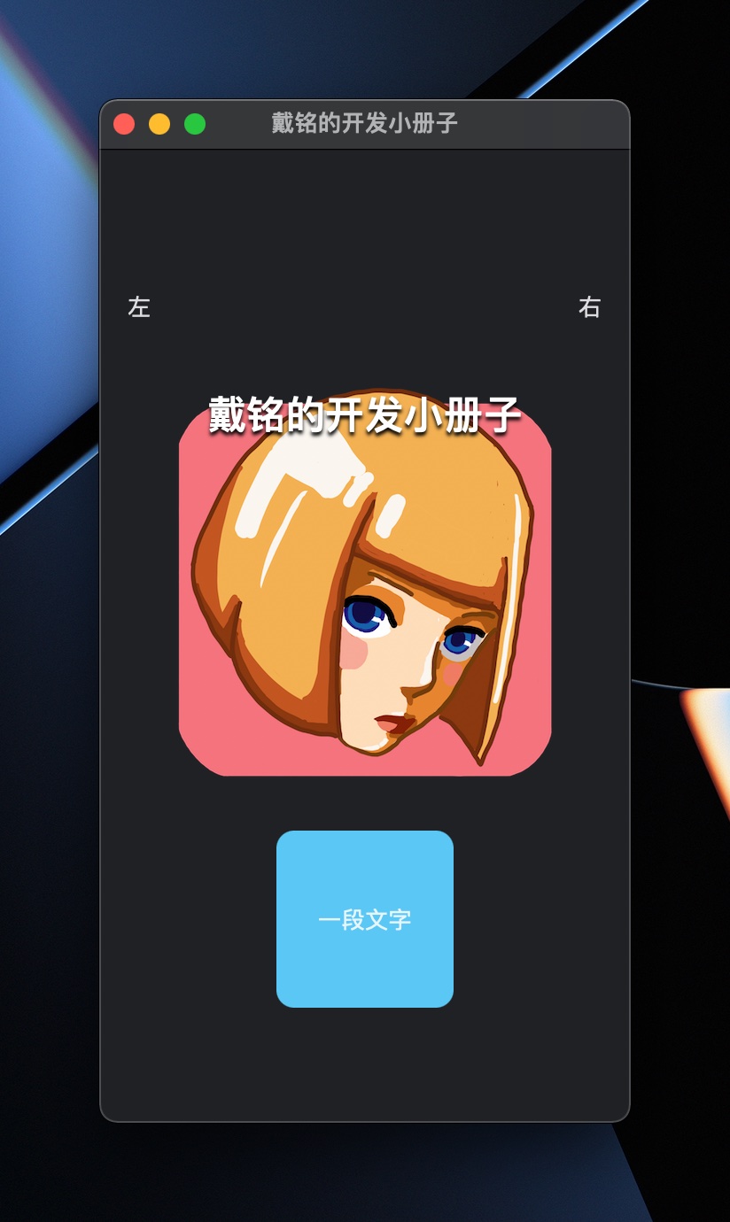
以下内容已整理到小册子中,本文会随着系统更新和我更多的实践而新增和更新,你可以下载“戴铭的开发小册子”应用,来跟踪查看本文内容新增和更新。小册子应用的代码可以在 Github 上查看。
本文属于小册子系列中的一篇,已发布系列文章有:
- 小册子之如何使用 SwiftData 开发 SwiftUI 应用
- 小册子之简说 Widget 小组件
- 小册子之 List、Lazy 容器、ScrollView、Grid 和 Table 数据集合 SwiftUI 视图
- 【本篇】小册子之详说 Navigation、ViewThatFits、Layout 协议等布局 SwiftUI 组件
- 小册子之 Form、Picker、Toggle、Slider 和 Stepper 表单相关 SwiftUI 视图
- 小册子之 SwiftUI 动画
Navigation导航
Navigation
控制导航启动状态、管理 size class 之间的 transition 和响应 deep link。
Navigation bar 有新的默认行为,如果没有提供标题,导航栏默认为 inline title 显示模式。使用 navigationBarTitleDisplayMode(_:) 改变显示模式。如果 navigation bar 没有标题、工具栏项或搜索内容,它就会自动隐藏。使用 .toolbar(.visible) modifier 显示一个空 navigation bar。
参考:
- Migrating to New Navigation Types 官方迁移指南
- NavigationStack
- NavigationSplitView
- The SwiftUI cookbook for navigation
NavigationStack 的示例:
struct PNavigationStack: View {
    @State private var a = [1, 3, 9] // 深层链接
    var body: some View {
        NavigationStack(path: $a) {
            List(1..<10) { i in
                NavigationLink(value: i) {
                    Label("第 \(i) 行", systemImage: "\(i).circle")
                }
            }
            .navigationDestination(for: Int.self) { i in
                Text("第 \(i) 行内容")
            }
            .navigationTitle("NavigationStack Demo")
        }
    }
}
这里的 path 设置了 stack 的深度路径。
NavigationSplitView 两栏的例子:
struct PNavigationSplitViewTwoColumn: View {
    @State private var a = ["one", "two", "three"]
    @State private var choice: String?

    var body: some View {
        NavigationSplitView {
            List(a, id: \.self, selection: $choice, rowContent: Text.init)
        } detail: {
            Text(choice ?? "选一个")
        }
    }
}
NavigationSplitView 三栏的例子:
struct PNavigationSplitViewThreeColumn: View {
    struct Group: Identifiable, Hashable {
        let id = UUID()
        var title: String
        var subs: [String]
    }

    @State private var gps = [
        Group(title: "One", subs: ["o1", "o2", "o3"]),
        Group(title: "Two", subs: ["t1", "t2", "t3"])
    ]

    @State private var choiceGroup: Group?
    @State private var choiceSub: String?

    @State private var cv = NavigationSplitViewVisibility.automatic

    var body: some View {
        NavigationSplitView(columnVisibility: $cv) {
            List(gps, selection: $choiceGroup) { g in
                Text(g.title).tag(g)
            }
            .navigationSplitViewColumnWidth(250)
        } content: {
            List(choiceGroup?.subs ?? [], id: \.self, selection: $choiceSub) { s in
                Text(s)
            }
        } detail: {
            Text(choiceSub ?? "选一个")
            Button("点击") {
                cv = .all
            }
        }
        .navigationSplitViewStyle(.prominentDetail)
    }
}
navigationSplitViewColumnWidth() 是用来自定义宽的,navigationSplitViewStyle 设置为 .prominentDetail 是让 detail 的视图尽量保持其大小。
SwiftUI 新加了个功能可以配置是否隐藏 Tabbar,这样在从主页进入下一级时就可以选择不显示底部标签栏了,示例代码如下:
ContentView().toolbar(.hidden, in: .tabBar)相比较以前 NavigationView 增强的是 destination 可以根据值的不同类型展示不同的目的页面,示例代码如下:
struct PNavigationStackDestination: View {
    var body: some View {
        NavigationStack {
            List {
                NavigationLink(value: "字符串") {
                    Text("字符串")
                }
                NavigationLink(value: Color.red) {
                    Text("红色")
                }
            }
            .navigationTitle("不同类型 Destination")
            .navigationDestination(for: Color.self) { c in
                c.clipShape(Circle())
            }
            .navigationDestination(for: String.self) { s in
                Text("\(s) 的 detail")
            }
        }
    }
}
对 toolbar 的自定义,示例如下:
.toolbar(id: "toolbar") {
    ToolbarItem(id: "new", placement: .secondaryAction) {
        Button(action: {}) {
            Label("New Invitation", systemImage: "envelope")
        }
    }
}
.toolbarRole(.editor)
以下是废弃的 NavigationView 的用法。
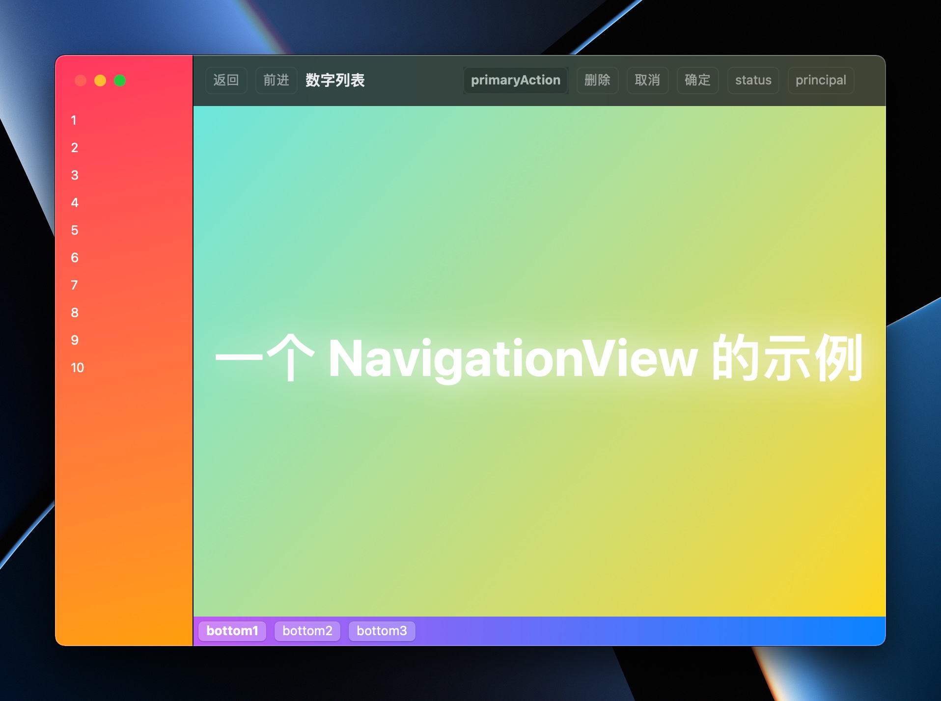
对应代码如下:
struct PlayNavigationView: View {
    let lData = 1...10
    var body: some View {
        NavigationView {
            ZStack {
                LinearGradient(colors: [.pink, .orange], startPoint: .topLeading, endPoint: .bottomTrailing)
                    .ignoresSafeArea()

                List(lData, id: \.self) { i in
                    NavigationLink {
                        PNavDetailView(contentStr: "\(i)")
                    } label: {
                        Text("\(i)")
                    }
                }
            }

            ZStack {
                LinearGradient(colors: [.mint, .yellow], startPoint: .topLeading, endPoint: .bottomTrailing)
                    .ignoresSafeArea()

                VStack {
                    Text("一个 NavigationView 的示例")
                        .bold()
                        .font(.largeTitle)
                        .shadow(color: .white, radius: 9, x: 0, y: 0)
                        .scaleEffect(2)
                }
            }
            .safeAreaInset(edge: .bottom) {
                HStack {
                    Button("bottom1") {}
                    .font(.headline)
                    Button("bottom2") {}
                    Button("bottom3") {}
                    Spacer()
                }
                .padding(5)
                .background(LinearGradient(colors: [.purple, .blue], startPoint: .topLeading, endPoint: .bottomTrailing))
            }
        }
        .foregroundColor(.white)
        .navigationTitle("数字列表")
        .toolbar {
            // placement 共有 keyboard、destructiveAction、cancellationAction、confirmationAction、status、primaryAction、navigation、principal、automatic 这些
            ToolbarItem(placement: .primaryAction) {
                Button("primaryAction") {}
                .background(.ultraThinMaterial)
                .font(.headline)
            }
            // 通过 ToolbarItemGroup 可以简化相同位置 ToolbarItem 的编写。
            ToolbarItemGroup(placement: .navigation) {
                Button("返回") {}
                Button("前进") {}
            }
            PCToolbar(doDestruct: {
                print("删除了")
            }, doCancel: {
                print("取消了")
            }, doConfirm: {
                print("确认了")
            })
            ToolbarItem(placement: .status) {
                Button("status") {}
            }
            ToolbarItem(placement: .principal) {
                Button("principal") {

                }
            }
            ToolbarItem(placement: .keyboard) {
                Button("Touch Bar Button") {}
            }
        } // end toolbar
    }
}

// MARK: - NavigationView 的目的页面
struct PNavDetailView: View {
    @Environment(\.presentationMode) var pMode: Binding<PresentationMode>
    var contentStr: String
    var body: some View {
        ZStack {
            LinearGradient(colors: [.purple, .blue], startPoint: .topLeading, endPoint: .bottomTrailing)
                .ignoresSafeArea()
            VStack {
                Text(contentStr)
                Button("返回") {
                    pMode.wrappedValue.dismiss()
                }
            }
        } // end ZStack
    } // end body
}

// MARK: - 自定义 toolbar
// 通过 ToolbarContent 创建可重复使用的 toolbar 组
struct PCToolbar: ToolbarContent {
    let doDestruct: () -> Void
    let doCancel: () -> Void
    let doConfirm: () -> Void

    var body: some ToolbarContent {
        ToolbarItem(placement: .destructiveAction) {
            Button("删除", action: doDestruct)
        }
        ToolbarItem(placement: .cancellationAction) {
            Button("取消", action: doCancel)
        }
        ToolbarItem(placement: .confirmationAction) {
            Button("确定", action: doConfirm)
        }
    }
}
toolbar 的位置设置可选项如下:
- primaryAction:放置到最主要位置,macOS 就是放在 toolbar 的最左边
- automatic:根据平台不同放到默认位置
- confirmationAction:一些确定的动作
- cancellationAction:取消动作
- destructiveAction:删除的动作
- status:状态变化,比如检查更新等动作
- navigation:导航动作,比如浏览器的前进后退
- principal:突出的位置,iOS 和 macOS 会出现在中间的位置
- keyboard:macOS 会出现在 Touch Bar 里。iOS 会出现在弹出的虚拟键盘上。
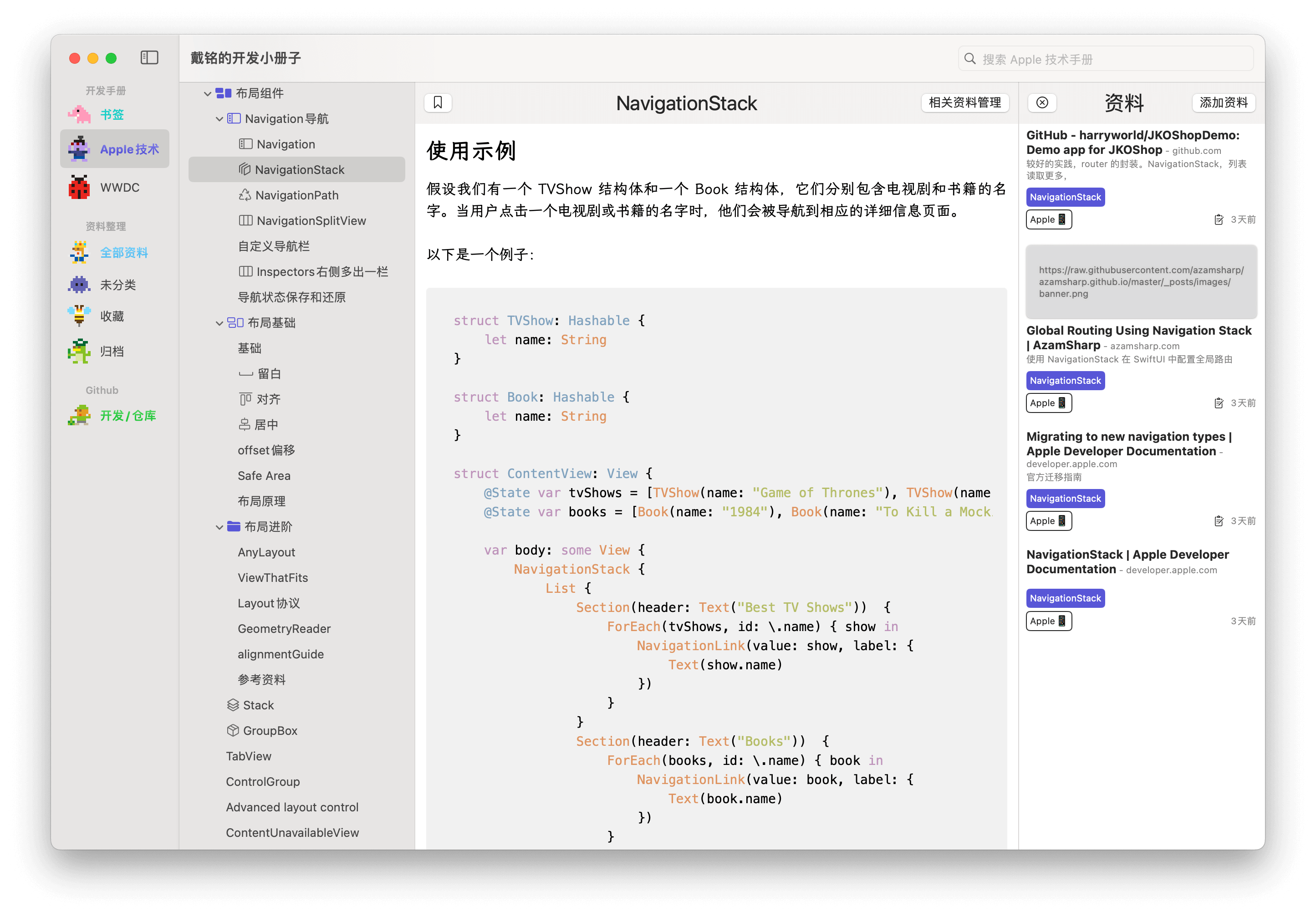
NavigationStack
使用示例
假设我们有一个 TVShow 结构体和一个 Book 结构体,它们分别包含电视剧和书籍的名字。当用户点击一个电视剧或书籍的名字时,他们会被导航到相应的详细信息页面。
以下是一个例子:
struct TVShow: Hashable {
    let name: String
}

struct Book: Hashable {
    let name: String
}

struct ContentView: View {
    @State var tvShows = [TVShow(name: "Game of Thrones"), TVShow(name: "Breaking Bad")]
    @State var books = [Book(name: "1984"), Book(name: "To Kill a Mockingbird")]

    var body: some View {
        NavigationStack {
            List {
                Section(header: Text("Best TV Shows"))  {
                    ForEach(tvShows, id: \.name) { show in
                        NavigationLink(value: show, label: {
                            Text(show.name)
                        })
                    }
                }
                Section(header: Text("Books"))  {
                    ForEach(books, id: \.name) { book in
                        NavigationLink(value: book, label: {
                            Text(book.name)
                        })
                    }
                }
            }
            .navigationDestination(for: TVShow.self) { show in
                TVShowView(show: show)
            }
            .navigationDestination(for: Book.self) { book in
                BookView(book: book)
            }
            .navigationTitle(Text("Media"))
        }
    }
}

struct TVShowView: View {
    let show: TVShow

    var body: some View {
        Text("Details for \(show.name)")
    }
}

struct BookView: View {
    let book: Book

    var body: some View {
        Text("Details for \(book.name)")
    }
}
全局路由
先写个路由的枚举
enum Route: Hashable {
    case all
    case add(Book)
    case detail(Book)
}

struct Book {
    let name: String
    let des: String
}
在 App 中设置好全局路由
@main
struct LearnNavApp: App {
    var body: some Scene {
        WindowGroup {
            NavigationStack {
                ContentView()
                    .navigationDestination(for: Route.self) { route in
                        switch route {
                            case .all:
                                Text("显示所有图书")
                            case .create(let book):
                                Text("添加书 \(book.name)")
                            case .detail(let book):
                                Text("详细 \(book.des)")
                        }
                    }
            }

        }
    }
}
所有视图都可调用,调用方式如下:
NavigationLink("查看书籍详细说明", value: Route.detail(Book(name: "1984", des: "1984 Detail")))NavigationPath
NavigationPath 是一个用于管理 SwiftUI 中导航路径的工具。它可以帮助你在 SwiftUI 中实现更复杂的导航逻辑。
在 SwiftUI 中,我们通常使用 NavigationLink 来实现导航。然而,NavigationLink 只能实现简单的前进导航,如果你需要实现更复杂的导航逻辑,例如后退、跳转到任意页面等,你就需要使用 NavigationPath。
NavigationPath 的工作原理是,它维护了一个路径数组,每个元素代表一个页面。当你需要导航到一个新的页面时,你只需要将这个页面添加到路径数组中。当你需要后退时,你只需要从路径数组中移除最后一个元素。这样,你就可以实现任意复杂的导航逻辑。
看个例子
假设我们有一个 TVShow 结构体,它包含电视剧的名字。当用户点击一个电视剧的名字时,他们会被导航到这个电视剧的详细信息页面。
struct ContentView: View {
    @State private var path = NavigationPath()
    @State private var tvShows = [ TVShow(name: "Game of Thrones"), TVShow(name: "Breaking Bad"), TVShow(name: "The Witcher") ]

    var body: some View {
        NavigationStack(path: $path) {
            List {
                Text("Select a TV show to get started.")
                    .font(.subheadline.weight(.semibold))
                ForEach(tvShows, id: \.name) { show in
                    NavigationLink(value: show, label: {
                        Text(show.name)
                            .font(.subheadline.weight(.medium))
                    })
                }
                Button(action: showFriends) {
                    Text("This isn't navigation")
                }
            }
            .navigationDestination(for: TVShow.self, destination: { show in
                TVShowView(onSelectReset: { popToRoot() }, show: show, otherShows: tvShows)
            })
            .navigationTitle(Text("Select your show"))
        }
        .onChange(of: path.count) { oldValue, newValue in
            print(newValue)
        }
    }

    func showFriends() {
        let show = TVShow(name: "Friends")
        path.append(show)
    }

    func popToRoot() {
        path.removeLast(path.count)
    }
}

struct TVShowView: View {
    var onSelectReset: () -> Void
    var show: TVShow
    var otherShows: [TVShow]

    var body: some View {
        VStack {
            Text(show.name)
                .font(.title)
                .padding(.bottom)
            Button(action: onSelectReset) {
                Text("Reset Selection")
            }
            List(otherShows, id: \.name) { otherShow in
                Text(otherShow.name)
            }
        }
        .padding()
    }
}

struct TVShow: Hashable {
    let name: String
    let premiereDate: Date = Date.now
    var description: String = "detail"
}代码中,NavigationPath 被用作一个 @State 变量,这意味着它会自动响应变化,并更新视图。当你修改 NavigationPath 中的路径数组时,视图会自动更新,显示新的页面。
NavigationSplitView
以下是一个基于 NavigationSplitView 的三栏视图的示例。这个示例包含了一个主视图,一个次级视图和一个详细视图。
struct ContentView: View {
    @State var books: [Book] = [
        Book(title: "Book 1", author: "Author 1", description: "Description 1"),
        Book(title: "Book 2", author: "Author 2", description: "Description 2"),
        Book(title: "Book 3", author: "Author 3", description: "Description 3")
    ]
    @State var selectedBook: Book?
    @State var splitVisibility: NavigationSplitViewVisibility = .all

    var body: some View {
        NavigationSplitView(columnVisibility: $splitVisibility, sidebar: {
            List(books) { book in
                Button(action: { selectedBook = book }) {
                    Text(book.title)
                }
            }
        }, content: {
            if let book = selectedBook {
                Text("Author: \(book.author)")
            } else {
                Text("Select a Book")
            }
        }, detail: {
            if let book = selectedBook {
                Text(book.description)
            } else {
                Text("Book details will appear here")
            }
        })
        .onChange(of: selectedBook) { oldValue, newValue in
            //...
        }
    }
}

struct Book: Identifiable, Equatable {
    var id = UUID()
    var title: String
    var author: String
    var description: String
}示例中,sidebar 是主视图,它显示了一个图书列表。当用户选择一个图书时,content 视图会显示图书的作者,detail 视图会显示图书的详细信息。NavigationSplitView 会根据 splitVisibility 的值来决定显示哪些视图。
自定义导航栏
交互样式
使用 navigationSplitViewStyle(_:) 修饰符
改变标签栏背景色
.toolbarBackground(.yellow.gradient, for: .automatic)
.toolbarBackground(.visible, for: .automatic)
列宽
navigationSplitViewColumnWidth(_:) 修饰符用于指定列宽。
设置列的最小、最大和理想大小,使用 navigationSplitViewColumnWidth(min:ideal:max:)。可以修饰于不同的列上。
自定返回按钮
先通过修饰符隐藏系统返回按钮 .navigationBarBackButtonHidden(true)。然后通过 ToolbarItem(placement: .navigationBarLeading) 来添加自定义的返回按钮。
struct BookDetailView: View {
    var book: Book
    @Binding var isDetailShown: Bool

    var body: some View {
        VStack {
            Text(book.title).font(.largeTitle)
            Text("Author: \(book.author)").font(.title)
            Text(book.description).padding()
        }
        .navigationBarBackButtonHidden(true)
        .navigationTitle(book.title)
        .toolbar {
            ToolbarItem(placement: .navigationBarLeading) {
                Button {
                    isDetailShown = false
                } label: {
                    HStack {
                        Image(systemName: "chevron.backward")
                        Text("Back to Books")
                    }
                }
            }
        }
    }
}
Inspectors右侧多出一栏
Inspector 的示例
struct Book: Identifiable {
    var id = UUID()
    var title: String
    var author: String
    var description: String
}

struct ContentView: View {
    @State var books: [Book] = [
        Book(title: "Book 1", author: "Author 1", description: "Description 1"),
        Book(title: "Book 2", author: "Author 2", description: "Description 2"),
        Book(title: "Book 3", author: "Author 3", description: "Description 3")
    ]
    @State var selectedBook: Book?
    @State var showInspector: Bool = false
    @State var splitVisibility: NavigationSplitViewVisibility = .all

    var body: some View {
        NavigationSplitView(columnVisibility: $splitVisibility, sidebar: {
            List(books) { book in
                Button(action: { selectedBook = book }) {
                    Text(book.title)
                }
            }
        }, content: {
            if let book = selectedBook {
                Text("Author: \(book.author)")
            } else {
                Text("Select a Book")
            }
        }, detail: {
            Button("Inspector 开关") {
                showInspector.toggle()
            }
            if let book = selectedBook {
                Text(book.description)
            } else {
                Text("Book details will appear here")
            }
        })
        .inspector(isPresented: $showInspector) {
            if let book = selectedBook {
                InspectorView(book: book)
            }
        }
    }
}

struct InspectorView: View {
    var book: Book

    var body: some View {
        VStack {
            Text(book.title).font(.largeTitle)
            Text("Author: \(book.author)").font(.title)
            Text(book.description).padding()
        }
        .inspectorColumnWidth(200)
        .presentationDetents([.medium, .large])
    }
}
它显示了一个图书列表。当用户选择一个图书时,会显示 InspectorView,这是辅助视图,它显示了图书的详细信息。inspector 方法用于显示和隐藏 InspectorView,inspectorColumnWidth 方法用于设置辅助视图的宽度,presentationDetents 方法用于设置辅助视图的大小。
导航状态保存和还原
通过 SceneStorage 保存导航路径,程序终止时会持久化存储路径,重启时恢复路径。
protocol URLProcessor<RouteType> {
    associatedtype RouteType: Hashable
    func process(_ url: URL, mutating: inout [RouteType])
}

protocol UserActivityProcessor<RouteType> {
    associatedtype RouteType: Hashable
    func process(_ activity: NSUserActivity, mutating: inout [RouteType])
}

@Observable
@MainActor final class RouteManager<RouteType: Hashable> {
    var navigationPath: [RouteType] = []

    private let jsonDecoder = JSONDecoder()
    private let jsonEncoder = JSONEncoder()
    private let urlProcessor: any URLProcessor<RouteType>
    private let activityProcessor: any UserActivityProcessor<RouteType>

    init(
        urlProcessor: some URLProcessor<RouteType>,
        activityProcessor: some UserActivityProcessor<RouteType>
    ) {
        self.urlProcessor = urlProcessor
        self.activityProcessor = activityProcessor
    }

    func process(_ activity: NSUserActivity) {
        activityProcessor.process(activity, mutating: &navigationPath)
    }

    func process(_ url: URL) {
        urlProcessor.process(url, mutating: &navigationPath)
    }
}

extension RouteManager where RouteType: Codable {
    func toData() -> Data? {
        try? jsonEncoder.encode(navigationPath)
    }

    func restore(from data: Data) {
        do {
            navigationPath = try jsonDecoder.decode([RouteType].self, from: data)
        } catch {
            navigationPath = []
        }
    }
}
这段代码定义了一个名为 RouteManager 的类,它用于处理和管理导航路径。这个类使用了 SwiftUI 的 @MainActor 和 @Observable 属性包装器,以确保它的操作在主线程上执行,并且当 navigationPath 发生变化时,会自动更新相关的 UI。
RouteManager 类有两个协议类型的属性:urlProcessor 和 activityProcessor。这两个属性分别用于处理 URL 和用户活动(NSUserActivity)。这两个处理器的任务是根据给定的 URL 或用户活动,更新 navigationPath。
RouteManager 类还有两个方法:process(_ activity: NSUserActivity) 和 process(_ url: URL)。这两个方法分别用于处理用户活动和 URL。处理的方式是调用相应的处理器的 process 方法。
此外,RouteManager 类还有一个扩展,这个扩展只适用于 RouteType 是 Codable 的情况。这个扩展提供了两个方法:toData() 和 restore(from data: Data)。toData() 方法将 navigationPath 转换为 Data,restore(from data: Data) 方法则将 Data 转换回 navigationPath。这两个方法可以用于将 navigationPath 保存到磁盘,并在需要时从磁盘恢复。
struct MainView: View {
    @SceneStorage("navigationState") private var navigationData: Data?
    @State private var dataStore = DataStore()
    @State private var routeManager = RouteManager<Route>(
        urlProcessor: SomeURLProcessor(),
        activityProcessor: SomeUserActivityProcessor()
    )

    var body: some View {
        NavigationStack(path: $routeManager.navigationPath) {
            SomeView(categories: dataStore.categories)
                .task { await dataStore.fetch() }
                .navigationDestination(for: Route.self) { route in
                    // ...
                }
                .onOpenURL { routeManager.process($0) }
        }
        .task {
            if let navigationData = navigationData {
                routeManager.restore(from: navigationData)
            }

            for await _ in routeManager.$navigationPath.values {
                navigationData = routeManager.toData()
            }
        }
    }
}
@SceneStorage("navigationState") 是用来保存和恢复导航状态的。当应用程序被挂起时,它会自动将 navigationData 保存到磁盘,当应用程序重新启动时,它会自动从磁盘恢复 navigationData。
@State private var dataStore = DataStore() 和 @State private var routeManager = RouteManager<Route>(...) 是用来存储数据和路由管理器的。DataStore 是用来获取和存储数据的,RouteManager 是用来处理和管理导航路径的。
body 属性定义了视图的内容。它首先创建了一个 NavigationStack,然后在这个 NavigationStack 中创建了一个 SomeView。SomeView 使用了 dataStore.categories 作为它的参数,并且在被创建后立即执行 dataStore.fetch() 来获取数据。
body 属性还定义了一个任务,这个任务在视图被创建后立即执行。这个任务首先检查 navigationData 是否存在,如果存在,就使用 routeManager.restore(from: navigationData) 来恢复导航路径。然后,它监听 routeManager.$navigationPath.values,每当 navigationPath 发生变化时,就使用 routeManager.toData() 来将 navigationPath 转换为 Data,并将结果保存到 navigationData 中。
布局基础
布局-基础
基本元素样式
通过 .font(.title) 设置字体大小。
.stroke(Color.blue) 设置描边。举个例子:
struct ContentView: View {

    var body: some View {
        Rectangle()
            .stroke(Color.orange, style: StrokeStyle(lineWidth: 10, lineCap: .round, dash: [30]))
            .padding(30)
    }
}
StrokeStyle(lineWidth: 10, lineCap: .round, dash: [30]) 定义了描边的样式,其中 lineWidth: 10 表示线宽为 10,lineCap: .round 表示线帽样式为圆形,dash: [30] 表示虚线模式,数组中的数字表示虚线和间隙的交替长度。
frame
.frame(width: 200, height:100, alignment: .topLeading)
width: 200表示视图的宽度为 200 点。height: 100表示视图的高度为 100 点。alignment: .topLeading表示视图的内容应该在视图的左上角对齐。.topLeading是 SwiftUI 中的一个对齐方式,表示左上角对齐。
Stack
多个视图通过 Stack 视图进行对齐排列。这些 Stack 视图主要是:
- ZStack:Z轴排列
- VStack:垂直排列
- HStack:横向排列
间隔
视图之间的间隔可以用 Space(),它可以在各种布局视图中使用。
布局-留白
Space
Spacer 是一个灵活的空间,它会尽可能地占用多的空间,从而将其周围的视图推向堆栈的两边。因此,第一个 Text 视图会被推到左边,第二个 Text 视图会被推到中间,第三个 Text 视图会被推到右边。
struct ContentView: View {
    var body: some View {
        HStack {
            Text("左边")
            Spacer()
            Text("中间")
            Spacer()
            Text("右边")
        }
    }
}
下面这个例子是用 Space() 让三个视图都居右。
struct ContentView: View {
    var body: some View {
        HStack {
            Spacer()
            Text("视图1")
            Text("视图2")
            Text("视图3")
        }
    }
}
布局-对齐
frame 对齐
.frame(width: 100, height: 50, alignment: .topLeading)可设置对齐的视图
在 SwiftUI 中,许多视图都接受 alignment 参数,用于控制其子视图的对齐方式。以下是一些常见的接受 alignment 参数的视图:
HStack(alignment: .bottom):水平堆栈视图,可以控制其子视图在垂直方向上的对齐方式。VStack(alignment: .trailing):垂直堆栈视图,可以控制其子视图在水平方向上的对齐方式。ZStack(alignment: .center):深度堆栈视图,可以控制其子视图在水平和垂直方向上的对齐方式。GridRow(alignment: .firstTextBaseline):用于定义网格的行或列的大小,可以设置行或列中的内容的对齐方式。。
基线对齐
你可以使用 alignment 参数来设置视图的对齐方式,包括基线对齐。以下是一个例子:
HStack(alignment: .firstTextBaseline) {
    Text("Hello")
    Text("World").font(.largeTitle)
}在这个例子中,HStack 是一个水平堆栈视图,它会将其子视图水平排列。alignment: .firstTextBaseline 是一个参数,用于设置堆栈中的内容的对齐方式。.firstTextBaseline 表示所有文本视图都应该根据它们的第一行的基线对齐。基线是文本字符的底部线。
因此,这个 HStack 中的两个 Text 视图会根据它们的第一行的基线对齐,即使它们的字体大小不同。
布局-居中
在 SwiftUI 中,有多种方法可以使视图居中:
Spacer
使用 Spacer:Spacer 是一个灵活的空间,它会尽可能地占用多的空间,从而将其周围的视图推向堆栈的两边。如果在一个视图的两边都放置一个 Spacer,那么这个视图就会被推到中间。
HStack {
    Spacer()
    Text("居中")
    Spacer()
}
alignment
使用 alignment 参数:许多 SwiftUI 视图都接受 alignment 参数,用于控制其子视图的对齐方式。例如,VStack 和 HStack 都接受 alignment 参数。
VStack(alignment: .center) {
    Text("居中")
}
frame
使用 frame 方法:frame 方法可以设置视图的尺寸和对齐方式。如果你想让一个视图在其父视图中居中,你可以使用 frame(maxWidth: .infinity, maxHeight: .infinity) 来使视图尽可能地占用多的空间,然后使用 alignment: .center 来使视图在这个空间中居中。
Text("居中")
    .frame(maxWidth: .infinity, maxHeight: .infinity, alignment: .center)
布局-offset偏移
struct OffsetDemo: View {
    @State var offset: CGFloat = 0
    var body: some View {
        VStack {
            Text("Hello, World!")
                .font(.largeTitle)
                .offset(y: offset)
            Slider(value: $offset, in: -100...100)
                .padding()
        }
    }
}
我们创建了一个 Text 视图和一个 Slider。Text 视图使用了 .offset(y: offset) 修饰符,这意味着它的 y 偏移量会根据 offset 的值改变。Slider 则用于改变 offset 的值。当你移动滑块时,Text 视图的位置也会相应地上下移动。
Safe Area
ignoresSafeArea 忽略安全区域
使用 .ignoresSafeArea() 可以忽略安全区域。默认是所有方向都忽略。
如果只忽略部分方向,可以按照下面方法做:
// 默认会同时包含 .keyboard 和 .container。
.ignoresSafeArea(edges: .top)
.ignoresSafeArea(edges: .vertical)
.ignoresSafeArea(edges: [.leading, .trailing])

// 可以对安全区域分别指定
.ignoresSafeArea(.keyboard, edges: .top)
.ignoresSafeArea(.container, edges: [.leading, .trailing])
safeAreaInset
safeAreaInset 是 SwiftUI 中的一个属性,它允许你将视图放置在安全区域内。”安全区域”是指设备屏幕上的一块区域,这块区域不会被系统界面(如状态栏、导航栏、工具栏、Tab栏等)遮挡。
例如,你可以使用 safeAreaInset 将一个视图放置在屏幕底部的安全区域内,代码如下:
VStack {
    Text("Hello, World!")
}
.safeAreaInset(edge: .bottom, spacing: 10) {
    Button("Press me") {
        print("Button pressed")
    }
}
在这个例子中,”Press me” 按钮会被放置在屏幕底部的安全区域内,而且距离底部有 10 个点的间距。
下面是更完整点的例子:
struct ContentView: View {
    @State var tasks: [TaskModel] = (0...10).map { TaskModel(name: "Task \($0)") }
    @State var taskName = ""
    @State var isFocused: Bool = false

    var body: some View {
        NavigationView {
            VStack {
                List {
                    ForEach(tasks) { task in
                        Text(task.name)
                    }
                }
                .listStyle(PlainListStyle())
                .safeAreaInset(edge: .bottom) {
                    HStack {
                        TextField("Add task", text: $taskName, onCommit: {
                            addTask()
                        })
                        .textFieldStyle(RoundedBorderTextFieldStyle())
                        .padding(.leading, 10)

                        Button(action: {
                            addTask()
                        }) {
                            Image(systemName: "plus")
                        }
                        .padding(.trailing, 10)
                    }
                    .padding(.bottom, isFocused ? 0 : 10)
                    .background(Color.white)
                }
                .onReceive(NotificationCenter.default.publisher(for: UIResponder.keyboardWillShowNotification)) { _ in
                    withAnimation {
                        isFocused = true
                    }
                }
                .onReceive(NotificationCenter.default.publisher(for: UIResponder.keyboardWillHideNotification)) { _ in
                    withAnimation {
                        isFocused = false
                    }
                }
            }
            .navigationBarTitle("Task List Demo")
        }
    }

    func addTask() {
        if !taskName.isEmpty {
            withAnimation {
                tasks.append(TaskModel(name: taskName))
            }
            taskName = ""
        }
    }
}

struct TaskModel: Identifiable {
    let id = UUID()
    let name: String
}
用户可以在底部的输入框中输入任务名称,然后点击 “+” 按钮将任务添加到任务清单中。添加的任务会显示在屏幕的上方。当键盘出现或消失时,底部的输入框会相应地移动,以确保不会被键盘遮挡。
布局原理
SwiftUI 的布局系统是一个两阶段的协商过程,涉及到父视图和子视图之间的交互。
建议阶段:在这个阶段,父视图会向子视图提出一个建议尺寸。这个建议尺寸是父视图希望子视图的大小。例如,如果父视图是一个 VStack,那么它可能会向子视图提出一个具有明确高度、宽度未指定的建议尺寸。
需求阶段:在这个阶段,子视图会根据父视图的建议尺寸来确定自己的需求尺寸。子视图可以选择接受父视图的建议尺寸,也可以选择返回一个不同的尺寸。例如,一个 Text 视图可能会返回一个刚好能够容纳其文本的尺寸。
在这个过程中,父视图和子视图都有可能影响最终的布局结果。父视图可以通过调整建议尺寸来影响子视图的大小,而子视图可以通过返回不同的需求尺寸来影响自己的大小。
在一些复杂的布局场景中,可能需要进行多轮的协商才能得到最终的布局结果。例如,如果一个视图使用了 GeometryReader 来获取其在父视图中的位置和尺寸,那么 GeometryReader 可能会在布局稳定之前,多次向子视图发送新的几何信息。
总的来说 SwiftUI 它允许父视图和子视图之间进行协商,以达到最佳的布局效果。
布局进阶
AnyLayout
使用 AnyLayout 包装布局组件,可以在布局之间进行切换,同时保持动画效果。
struct WeatherLayout: View {
    @State private var changeLayout = false

    var body: some View {
        let layout = changeLayout ? AnyLayout(HStackLayout()) : AnyLayout(VStackLayout())

        layout {
            WeatherView(icon: "sun.max.fill", temperature: 25, color: .yellow)
            WeatherView(icon: "cloud.rain.fill", temperature: 18, color: .blue)
            WeatherView(icon: "snow", temperature: -5, color: .white)
        }
        .animation(.default, value: changeLayout)
        .onTapGesture {
            changeLayout.toggle()
        }
    }
}

struct WeatherView: View {
    let icon: String
    let temperature: Int
    let color: Color

    var body: some View {
        VStack {
            Image(systemName: icon)
                .font(.system(size: 80))
                .foregroundColor(color)
            Text("\(temperature)°")
                .font(.system(size: 50))
                .foregroundColor(color)
        }
        .frame(width: 120, height: 120)
    }
}
代码中,我们创建了一个 WeatherView 视图,它包含一个天气图标和一个温度标签。然后,我们在 WeatherLayout 视图中使用 AnyLayout 来动态改变布局。用户可以通过点击视图来在水平布局和垂直布局之间切换。
ViewThatFits
ViewThatFits 是一个自动选择最适合当前屏幕大小的子视图进行显示的视图。它会根据可用空间的大小来决定如何布局和显示子视图。
ViewThatFits 是一个在 SwiftUI 中用于选择最适合显示的视图的组件。它的工作原理如下:
首先,
ViewThatFits会测量在特定轴(水平或垂直)或两个轴(水平和垂直)上的可用空间。这是通过 SwiftUI 的布局系统来完成的,该系统提供了当前视图的大小和位置信息。接着,
ViewThatFits会测量第一个视图的大小。这是通过调用视图的measure(in:)方法来完成的,该方法返回一个包含视图理想大小的CGSize值。如果第一个视图的大小适合可用空间,
ViewThatFits就会选择并放置这个视图。放置视图是通过调用视图的layout(in:)方法来完成的,该方法接受一个CGRect值,该值定义了视图在其父视图中的位置和大小。如果第一个视图的大小不适合可用空间,
ViewThatFits会继续测量第二个视图的大小。如果第二个视图的大小适合可用空间,ViewThatFits就会选择并放置这个视图。如果所有视图的大小都不适合可用空间,
ViewThatFits会选择并放置ViewBuilder闭包中的最后一个视图。ViewBuilder是一个特殊的闭包,它可以根据其内容动态创建视图。
ViewThatFits(in: .horizontal) {
    Text("晴天,气温25°") // 宽度在200到300之间
        .font(.title)
        .foregroundColor(.yellow)
    Text("晴天,25°") // 宽度在150到200之间
        .font(.title)
        .foregroundColor(.gray)
    Text("晴25") // 宽度在100到150之间
        .font(.title)
        .foregroundColor(.white)
}
.border(Color.green) // ViewThatFits所需的大小
.frame(width:200)
.border(Color.orange) // 父视图提议的大小
在不同的宽度下,ViewThatFits 会选择不同的视图进行显示。在上面的示例中,当父视图的宽度在100到150之间时,ViewThatFits 会选择显示 “晴25” 这个视图。
通过 ViewThatFits 来确定内容是否可滚动。
struct ContentView: View {
    @State var step: CGFloat = 3
    var count: Int {
        Int(step)
    }

    var body: some View {
        VStack(alignment:.leading) {
            Text("数量: \(count)")
                .font(.title)
                .foregroundColor(.blue)
            Stepper("数量", value: $step, in: 3...20)

            ViewThatFits {
                content
                ScrollView(.horizontal,showsIndicators: true) {
                    content
                }
            }
        }
        .padding()
    }

    var content: some View {
        HStack {
            ForEach(0 ..< count, id: \.self) { i in
                Rectangle()
                    .fill(Color.green)
                    .frame(width: 30, height: 30)
                    .overlay(
                        Text("\(i)")
                            .font(.headline)
                            .foregroundColor(.white)
                    )
            }
        }
    }
}
Layout协议
通过实现 Layout 协议,创建一个水平堆栈布局,其中所有子视图的宽度都相等。
struct OptimizedEqualWidthHStack: Layout {
  func sizeThatFits(proposal: ProposedViewSize, subviews: Subviews, cache: inout Void) -> CGSize {
    if subviews.isEmpty { return .zero }
    let maxSubviewSize = calculateMaxSize(subviews: subviews)
    let totalSpacing = calculateSpacing(subviews: subviews).reduce(0, +)
    return CGSize(width: maxSubviewSize.width * CGFloat(subviews.count) + totalSpacing, height: maxSubviewSize.height)
  }

  func placeSubviews(in bounds: CGRect, proposal: ProposedViewSize, subviews: Subviews, cache: inout Void) {
    if subviews.isEmpty { return }
    let maxSubviewSize = calculateMaxSize(subviews: subviews)
    let spacings = calculateSpacing(subviews: subviews)
    let placementProposal = ProposedViewSize(width: maxSubviewSize.width, height: maxSubviewSize.height)
    var nextX = bounds.minX + maxSubviewSize.width / 2
    for index in subviews.indices {
      subviews[index].place(at: CGPoint(x: nextX, y: bounds.midY), anchor: .center, proposal: placementProposal)
      nextX += maxSubviewSize.width + spacings[index]
    }
  }

  private func calculateMaxSize(subviews: Subviews) -> CGSize {
    return subviews.map { $0.sizeThatFits(.unspecified) }.reduce(.zero) { CGSize(width: max($0.width, $1.width), height: max($0.height, $1.height)) }
  }

  private func calculateSpacing(subviews: Subviews) -> [CGFloat] {
    return subviews.indices.map { $0 < subviews.count - 1 ? subviews[$0].spacing.distance(to: subviews[$0 + 1].spacing, along: .horizontal) : 0 }
  }
}
上面这段代码中 sizeThatFits 方法计算并返回布局容器需要的大小,以便排列其子视图。它首先检查子视图数组是否为空,如果为空则返回 .zero。然后,它计算子视图的最大尺寸和总间距,最后返回一个 CGSize 对象,其宽度等于最大子视图宽度乘以子视图数量加上总间距,高度等于最大子视图高度。
placeSubviews 方法将子视图放置在布局容器中。它首先检查子视图数组是否为空,如果为空则返回。然后,它计算子视图的最大尺寸和间距,然后遍历子视图数组,将每个子视图放置在布局容器中的适当位置。
calculateMaxSize 和 calculateSpacing 是两个私有方法,用于计算子视图的最大尺寸和间距。
GeometryReader
在 SwiftUI 中,有多种方法可以获取和控制视图的尺寸:
frame(width:60, height:60):这个方法会为子视图提供一个建议的尺寸,这里是 60 x 60。fixedSize():这个方法会为子视图提供一个未指定模式的建议尺寸,这意味着视图会尽可能地大以适应其内容。frame(minWidth: 120, maxWidth: 360):这个方法会将子视图的需求尺寸控制在指定的范围中,这里是宽度在 120 到 360 之间。frame(idealWidth: 120, idealHeight: 120):这个方法会返回一个需求尺寸,如果当前视图收到为未指定模式的建议尺寸,那么它会返回 120 x 120 的尺寸。GeometryReader:GeometryReader会将建议尺寸作为需求尺寸直接返回,这意味着它会充满全部可用区域。你可以使用GeometryReader来获取其内容的尺寸和位置。
GeometryReader 可以获取其内容的尺寸和位置。在这个例子中,我们使用 GeometryReader 来获取视图的尺寸,然后打印出来。这对于理解 SwiftUI 的布局系统和调试布局问题非常有用。
extension View {
    func logSizeInfo(_ label: String = "") -> some View {
        background(
            GeometryReader { proxy in
                Color.clear
                    .onAppear(perform: {
                        debugPrint("\(label) Size: \(proxy.size)")
                    })
            }
        )
    }
}

struct ContentView: View {
    var body: some View {
        VStack {
            Text("大标题")
                .font(.largeTitle)
                .logSizeInfo("大标题视图") // 打印视图尺寸
            Text("正文")
                .logSizeInfo("正文视图")
        }
    }
}
这段代码首先定义了一个 View 的扩展,添加了一个 logSizeInfo(_:) 方法。这个方法接受一个标签字符串作为参数,然后返回一个新的视图。这个新的视图在背景中使用 GeometryReader 来获取并打印视图的尺寸。
然后,我们创建了一个 VStack 视图,其中包含一个 Text 视图。我们为 Text 视图调用了 logSizeInfo(_:) 方法,以打印其尺寸。
如何利用 GeometryReader 来绘制一个圆形?
struct CircleView: View {
    var body: some View {
        GeometryReader { proxy in
            Path { path in
                let radius = min(proxy.size.width, proxy.size.height) / 2
                let center = CGPoint(x: proxy.size.width / 2, y: proxy.size.height / 2)
                path.addArc(center: center, radius: radius, startAngle: .zero, endAngle: .init(degrees: 360), clockwise: false)
            }
            .fill(Color.blue)
        }
    }
}
在这个例子中,我们首先获取 GeometryReader 的尺寸,然后计算出半径和中心点的位置。然后,我们使用 Path 的 addArc(center:radius:startAngle:endAngle:clockwise:) 方法来添加一个圆形路径。最后,我们使用 fill(_:) 方法来填充路径,颜色为蓝色。
关于 GeometryReader 性能问题
GeometryReader 是 SwiftUI 中的一个工具,它可以帮助我们获取视图的大小和位置。但是,它在获取这些信息时,需要等待视图被评估、布局和渲染完成。这就好比你在装修房子时,需要等待墙壁砌好、油漆干燥后,才能测量墙壁的尺寸。这个过程可能需要等待一段时间,而且可能需要多次重复,因为每次墙壁的尺寸改变,都需要重新测量。
这就是 GeometryReader 可能会影响性能的原因。它需要等待视图完成一轮的评估、布局和渲染,然后才能获取到尺寸数据,然后可能需要根据这些数据重新调整布局,这就需要再次进行评估、布局和渲染。这个过程可能需要重复多次,导致视图被多次重新评估和布局。
但是,随着 SwiftUI 的更新,这个问题已经有所改善。现在,我们可以创建自定义的布局容器,这些容器可以在布局阶段就获取到父视图的建议尺寸和所有子视图的需求尺寸,这样就可以避免反复传递尺寸数据,减少了视图的反复更新。
alignmentGuide
alignmentGuide是SwiftUI中的一个修饰符,它允许你自定义视图的对齐方式。你可以使用它来调整视图在其父视图或同级视图中的位置。
当你在一个视图上应用alignmentGuide修饰符时,你需要提供一个对齐标识符和一个闭包。对齐标识符定义了你想要调整的对齐方式(例如,.leading,.trailing,.center等)。闭包接收一个参数,这个参数包含了视图的尺寸,你可以使用这个参数来计算对齐指南的偏移量。
举个例子:
struct ContentView: View {
    var body: some View {
        HStack(alignment: .top) {
            CircleView()
                .alignmentGuide(.top) { vd in
                    vd[.top] + 50
                }
            CircleView()
        }
        .padding()
        .border(Color.gray)
    }

    struct CircleView: View {
        var body: some View {
            Circle()
                .fill(Color.mint)
                .frame(width: 50, height: 50)
        }
    }
}
在HStack中,第一个CircleView使用了.alignmentGuide修饰符,这使得它在顶部对齐时向下偏移了50个单位。
布局进阶-参考资料
WWDC
23
22
- Bring multiple windows to your SwiftUI app - WWDC22 - Videos - Apple Developer 为您的 SwiftUI App 添加多个窗口
20
- Stacks, Grids, and Outlines in SwiftUI - WWDC20 - Videos - Apple Developer SwiftUI 中的叠放、网格和大纲
- How to make your app look great on every screen - Discover - Apple Developer How to make your app look greate on every screen
官方接口文档
Stack
Stack View 有 VStack、HStack 和 ZStack
struct PlayStackView: View {
    var body: some View {
        // 默认是 VStack 竖排

        // 横排
        HStack {
            Text("左")
            Spacer()
            Text("右")
        }
        .padding()

        // Z 轴排
        ZStack(alignment: .top) {
            Image("logo")
            Text("戴铭的开发小册子")
                .font(.title)
                .bold()
                .foregroundColor(.white)
                .shadow(color: .black, radius: 1, x: 0, y: 2)
                .padding()
        }

        Color.cyan
            .cornerRadius(10)
            .frame(width: 100, height: 100)
            .overlay(
                Text("一段文字")
            )
    }
}
GroupBox
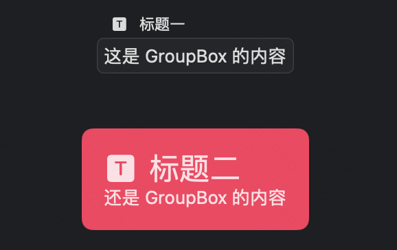
struct PlayGroupBoxView: View {
    var body: some View {
        GroupBox {
            Text("这是 GroupBox 的内容")
        } label: {
            Label("标题一", systemImage: "t.square.fill")
        }
        .padding()

        GroupBox {
            Text("还是 GroupBox 的内容")
        } label: {
            Label("标题二", systemImage: "t.square.fill")
        }
        .padding()
        .groupBoxStyle(PCGroupBoxStyle())

    }
}

struct PCGroupBoxStyle: GroupBoxStyle {
    func makeBody(configuration: Configuration) -> some View {
        VStack(alignment: .leading) {
            configuration.label
                .font(.title)
            configuration.content
        }
        .padding()
        .background(.pink)
        .clipShape(RoundedRectangle(cornerRadius: 8, style: .continuous))
    }
}
叠加 GroupBox 颜色会有区分
GroupBox {
    Text("电视剧名称: 人民的名义")

    GroupBox {
        Text("播放时间: 每周一至周五")
    }
}
最后,您还可以 GroupBox 使用 Label .将 Label 定位为 GroupBox 容器的标题。
GroupBox(label: Label("电视剧", systemImage: "tv")) {
    HStack {
        Text("播放时间: 每周一至周五")
            .padding()
        Spacer()
    }
}
GroupBox 也可以用于创建自定义的按钮组,如下所示:
struct TVShowCardView: View {
    var body: some View {
        VStack(alignment: .leading) {
            // The header of the card
            // - Photo, Show Name and Genre
            HStack {
                Circle()
                    .frame(width: 40, height: 40)
                    .foregroundColor(.gray)
                VStack(alignment: .leading, spacing: 3) {
                    Text("权力的游戏")
                        .font(.headline)
                        .fontWeight(.semibold)
                    Text("奇幻剧")
                        .font(.caption)
                }
                Spacer()
            }

            Divider()
                .foregroundColor(Color(uiColor: UIColor.systemGray6))
                .padding([.top, .bottom], 8)

            // The description of the show in a few lines
            Text("《权力的游戏》是一部改编自乔治·马丁的奇幻小说系列《冰与火之歌》的电视剧。")
                .font(.body)

            // Buttons to watch, share or save the show
            HStack {
                actionGroupBox(imageName: "play.rectangle", actionName: "观看", action: { print("Watching...") })
                actionGroupBox(imageName: "square.and.arrow.up", actionName: "分享", action: { print("Sharing...") })
                actionGroupBox(imageName: "bookmark", actionName: "保存", action: { print("Saving...") })
            }
        }
        .padding()
        .background(Color.white)
        .cornerRadius(10)
    }

    // A function to create a GroupBox for an action
    func actionGroupBox(imageName: String, actionName: String, action: @escaping () -> Void) -> some View {
        GroupBox {
            VStack(spacing: 5) {
                Image(systemName: imageName)
                    .font(.headline)
                Text(actionName)
                    .font(.caption)
            }
            .foregroundColor(.red)
            .frame(maxWidth: .infinity)
        }.onTapGesture {
            action()
        }
    }
}

struct ContentView: View {
    var body: some View {
        NavigationView {
            ScrollView {
                TVShowCardView()

                Spacer()
            }
            .padding()
            .background(Color(UIColor.systemGray6))
            .navigationTitle("电视剧")
            .shadow(color: Color(.sRGB, red: 0, green: 0, blue: 0, opacity: 0.25), radius: 10, x: 0, y: 0)
        }
    }
}
TabView
基本用法
struct PlayTabView: View {
    @State private var selection = 0

    var body: some View {
        ZStack(alignment: .bottom) {
            TabView(selection: $selection) {
                Text("one")
                    .tabItem {
                        Text("首页")
                            .hidden()
                    }
                    .tag(0)
                Text("two")
                    .tabItem {
                        Text("二栏")
                    }
                    .tag(1)
                Text("three")
                    .tabItem {
                        Text("三栏")
                    }
                    .tag(2)
                Text("four")
                    .tag(3)
                Text("five")
                    .tag(4)
                Text("six")
                    .tag(5)
                Text("seven")
                    .tag(6)
                Text("eight")
                    .tag(7)
                Text("nine")
                    .tag(8)
                Text("ten")
                    .tag(9)
            } // end TabView


            HStack {
                Button("上一页") {
                    if selection > 0 {
                        selection -= 1
                    }
                }
                .keyboardShortcut(.cancelAction)
                Button("下一页") {
                    if selection < 9 {
                        selection += 1
                    }
                }
                .keyboardShortcut(.defaultAction)
            } // end HStack
            .padding()
        }
    }
}
.tabViewStyle(PageTabViewStyle(indexDisplayMode: .never)) 可以实现 UIPageViewController 的效果,如果要给小白点加上背景,可以多添加一个 .indexViewStyle(PageIndexViewStyle(backgroundDisplayMode: .always)) 修改器。
添加提醒
struct ContentView: View {
    @State private var bookVm: BooksViewModel

    init() {
        bookVm = BooksViewModel()
    }

    var body: some View {
        TabView {
            BookListView(bookVm: bookVm)
                .tabItem {
                    Image(systemName: "list.bullet.rectangle.fill")
                    Text("Book List")
                }
            SelectedBooksView(bookVm: bookVm)
                .badge(bookVm.selectedBooks.count)
                .tabItem {
                    Image(systemName: "book.fill")
                    Text("Selected Books")
                }
        }
    }
}
自定义样式
iOS 14 和 macOS 11 开始可以使用 tabViewStyle 修饰符更改 TabView 样式。比如有页面指示器的水平滚动图片。
显示页面指示器:
.tabViewStyle(.page(indexDisplayMode: .always)).tabViewStyle(.page(indexDisplayMode: .never)) 修饰符隐藏页面指示器。
水平滚动图片:
struct ContentView: View {
    let images = ["pencil", "scribble", "highlighter"]

    var body: some View {
        VStack {
            TabView {
                ForEach(images, id: \.self) { imageName in
                    Image(systemName: imageName)
                        .resizable()
                        .scaledToFit()
                }
            }
            .tabViewStyle(.page(indexDisplayMode: .always))
            .frame(height: 100)
        }
    }
}
分页视图
struct OnboardingView: View {
    var body: some View {
        TabView {
            OnboardingPageView(imageName: "figure.mixed.cardio",
                               title: "Welcome",
                               description: "Welcome to MyApp! Get started by exploring our amazing features.")

            OnboardingPageView(imageName: "figure.archery",
                               title: "Discover",
                               description: "Discover new content and stay up-to-date with the latest news and updates.")

            OnboardingPageView(imageName: "figure.yoga",
                               title: "Connect",
                               description: "Connect with friends and share your experiences with the community.")
        }
        .tabViewStyle(.page(indexDisplayMode: .always))
        .indexViewStyle(PageIndexViewStyle(backgroundDisplayMode: .always))
    }
}
.indexViewStyle(PageIndexViewStyle(backgroundDisplayMode: .always)) 修饰符添加了背景。这将在点周围添加一个背景,使其在任何背景下都更容易看到。
背景颜色
iOS 16 和 macOS 13 开始可以更改 TabView 的背景颜色。
struct MainScreen: View {
    var body: some View {
        TabView {
            NavigationView {
                BookListView()
                    .navigationTitle("图书列表")
                    .toolbarBackground(.yellow, for: .navigationBar)
                    .toolbarBackground(.visible, for: .navigationBar)
            }
            .tabItem {
                Label("图书", systemImage: "book.closed")
            }

            UserPreferencesView()
                .tabItem {
                    Label("设置", systemImage: "gearshape")
                }
            .toolbarBackground(.indigo, for: .tabBar)
            .toolbarBackground(.visible, for: .tabBar)
            .toolbarColorScheme(.dark, for: .tabBar)
        }
    }
}

struct BookListView: View {
    var body: some View {
        Text("这里是图书列表")
    }
}

struct UserPreferencesView: View {
    var body: some View {
        Text("这里是用户设置")
    }
}
ControlGroup
struct PlayControlGroupView: View {
    var body: some View {
        ControlGroup {
            Button {
                print("plus")
            } label: {
                Image(systemName: "plus")
            }

            Button {
                print("minus")
            } label: {
                Image(systemName: "minus")
            }
        }
        .padding()
        .controlGroupStyle(.automatic) // .automatic 是默认样式,还有 .navigation
    }
}
Advanced layout control
session Compose custom layouts with SwiftUI
提供了新的 Grid 视图来同时满足 VStack 和 HStack。还有一个更低级别 Layout 接口,可以完全控制构建应用所需的布局。另外还有 ViewThatFits 可以自动选择填充可用空间的方式。
Grid 示例代码如下:
Grid {
    GridRow {
        Text("One")
        Text("One")
        Text("One")
    }
    GridRow {
        Text("Two")
        Text("Two")
    }
    Divider()
    GridRow {
        Text("Three")
        Text("Three")
            .gridCellColumns(2)
    }
}
gridCellColumns() modifier 可以让一个单元格跨多列。
ViewThatFits 的新视图,允许根据适合的大小放视图。ViewThatFits 会自动选择对于当前屏幕大小合适的子视图进行显示。Ryan Lintott 的示例效果 ,对应示例代码 LayoutThatFits.swift 。
新的 Layout 协议可以观看 Swift Talk 第 308 期 The Layout Protocol 。
通过符合 Layout 协议,我们可以自定义一个自定义的布局容器,直接参与 SwiftUI 的布局过程。新的 ProposedViewSize 结构,它是容器视图提供的大小。 Layout.Subviews 是布局视图的子视图代理集合,我们可以在其中为每个子视图请求各种布局属性。
public protocol Layout: Animatable {
  static var layoutProperties: LayoutProperties { get }
  associatedtype Cache = Void
  typealias Subviews = LayoutSubviews

  func updateCache(_ cache: inout Self.Cache, subviews: Self.Subviews)

  func spacing(subviews: Self.Subviews, cache: inout Self.Cache) -> ViewSpacing

  /// We return our view size here, use the passed parameters for computing the
  /// layout.
  func sizeThatFits(
    proposal: ProposedViewSize,
    subviews: Self.Subviews,
    cache: inout Self.Cache // 👈🏻 use this for calculated data shared among Layout methods
  ) -> CGSize

  /// Use this to tell your subviews where to appear.
  func placeSubviews(
    in bounds: CGRect, // 👈🏻 region where we need to place our subviews into, origin might not be .zero
    proposal: ProposedViewSize,
    subviews: Self.Subviews,
    cache: inout Self.Cache
  )

  // ... there are more a couple more optional methods
}
下面例子是一个自定义的水平 stack 视图,为其所有子视图提供其最大子视图的宽度:
struct MyEqualWidthHStack: Layout {
  /// Returns a size that the layout container needs to arrange its subviews.
  /// - Tag: sizeThatFitsHorizontal
  func sizeThatFits(
    proposal: ProposedViewSize,
    subviews: Subviews,
    cache: inout Void
  ) -> CGSize {
    guard !subviews.isEmpty else { return .zero }

    let maxSize = maxSize(subviews: subviews)
    let spacing = spacing(subviews: subviews)
    let totalSpacing = spacing.reduce(0) { $0 + $1 }

    return CGSize(
      width: maxSize.width * CGFloat(subviews.count) + totalSpacing,
      height: maxSize.height)
  }

  /// Places the stack's subviews.
  /// - Tag: placeSubviewsHorizontal
  func placeSubviews(
    in bounds: CGRect,
    proposal: ProposedViewSize,
    subviews: Subviews,
    cache: inout Void
  ) {
    guard !subviews.isEmpty else { return }

    let maxSize = maxSize(subviews: subviews)
    let spacing = spacing(subviews: subviews)

    let placementProposal = ProposedViewSize(width: maxSize.width, height: maxSize.height)
    var nextX = bounds.minX + maxSize.width / 2

    for index in subviews.indices {
      subviews[index].place(
        at: CGPoint(x: nextX, y: bounds.midY),
        anchor: .center,
        proposal: placementProposal)
      nextX += maxSize.width + spacing[index]
    }
  }

  /// Finds the largest ideal size of the subviews.
  private func maxSize(subviews: Subviews) -> CGSize {
    let subviewSizes = subviews.map { $0.sizeThatFits(.unspecified) }
    let maxSize: CGSize = subviewSizes.reduce(.zero) { currentMax, subviewSize in
      CGSize(
        width: max(currentMax.width, subviewSize.width),
        height: max(currentMax.height, subviewSize.height))
    }

    return maxSize
  }

  /// Gets an array of preferred spacing sizes between subviews in the
  /// horizontal dimension.
  private func spacing(subviews: Subviews) -> [CGFloat] {
    subviews.indices.map { index in
      guard index < subviews.count - 1 else { return 0 }
      return subviews[index].spacing.distance(
        to: subviews[index + 1].spacing,
        along: .horizontal)
    }
  }
}
自定义 layout 只能访问子视图代理 Layout.Subviews ,而不是视图或数据模型。我们可以通过 LayoutValueKey 在每个子视图上存储自定义值,通过 layoutValue(key:value:) modifier 设置。
private struct Rank: LayoutValueKey {
  static let defaultValue: Int = 1
}

extension View {
  func rank(_ value: Int) -> some View { // 👈🏻 convenience method
    layoutValue(key: Rank.self, value: value) // 👈🏻 the new modifier
  }
}
然后,我们就可以通过 Layout 方法中的 Layout.Subviews 代理读取自定义 LayoutValueKey 值:
func placeSubviews(
  in bounds: CGRect,
  proposal: ProposedViewSize,
  subviews: Subviews,
  cache: inout Void
) {
  let ranks = subviews.map { subview in
    subview[Rank.self] // 👈🏻
  }

  // ...
}
要在布局之间变化使用动画,需要用 AnyLayout,代码示例如下:
struct PAnyLayout: View {
    @State private var isVertical = false
    var body: some View {
        let layout = isVertical ? AnyLayout(VStack()) : AnyLayout(HStack())
        layout {
            Image(systemName: "star").foregroundColor(.yellow)
            Text("Starming.com")
            Text("戴铭")
        }
        Button("Click") {
            withAnimation {
                isVertical.toggle()
            }
        } // end button
    } // end body
}
同时 Text 和图片也支持了样式布局变化,代码示例如下:
struct PTextTransitionsView: View {
    @State private var expandMessage = true
    private let mintWithShadow: AnyShapeStyle = AnyShapeStyle(Color.mint.shadow(.drop(radius: 2)))
    private let primaryWithoutShadow: AnyShapeStyle = AnyShapeStyle(Color.primary.shadow(.drop(radius: 0)))

    var body: some View {
        Text("Dai Ming Swift Pamphlet")
            .font(expandMessage ? .largeTitle.weight(.heavy) : .body)
            .foregroundStyle(expandMessage ? mintWithShadow : primaryWithoutShadow)
            .onTapGesture { withAnimation { expandMessage.toggle() }}
            .frame(maxWidth: expandMessage ? 150 : 250)
            .drawingGroup()
            .padding(20)
            .background(.cyan.opacity(0.3), in: RoundedRectangle(cornerRadius: 6))
    }
}
ContentUnavailableView
基本用法
struct ArchivedInfosView: View {
    @Environment(\.modelContext) var modelContext
    @Query var infos: [IOInfo]
    ...

    var body: some View {
        List(selection: $selectInfo) {
            ForEach(infos) { info in
                ...
            }
        }
        .overlay {
            if infos.isEmpty {
                ContentUnavailableView {
                    Label("无归档", systemImage: "archivebox")
                } description: {
                    Text("点击下方按钮添加一个归档资料")
                } actions: {
                    Button("新增") {
                        addInfo()
                    }
                }
            }
        }
    }
    ...
}
搜索
struct ContentView: View {
    @Bindable var vm: VModel
    ...

    var body: some View {
        NavigationStack {
            List(vm.items, id: \.self) { item in
                ...
            }
            .navigationTitle("Products")
            .overlay {
                if vm.items.isEmpty {
                    ContentUnavailableView.search(text: vm.query)
                }
            }
            .searchable(text: $vm.query)
        }
        ...
    }
}